WebBOL© A internet programming tool from ACS Corporation |
This document explains how to use the editor to design your forms or web pages. Using the editor is easy and will become intuitive as your experience increases. It is similar to other graphical design programs you may have used. Such as Photoshop or Paint. It is the process of laying out text, colors, and assorted graphics to create a form or webpage. Each design program has its own nuances. The WebBOL editor has its nuances also.
This easiest way to learn the editor is to read this document in its entirety, then play with the programming samples provided. You should have read the "Execution & Programming Documentation" above before beginning this section.
Conceptual
The editor provides a canvas in which you will create your form. Adding, changing, deleting and moving controls, text and colors until you are satisfied with the form.
The canvas is based on a grid. A grid made up of rows and columns. Each row/column
location is called a cell. The cells are used to help you align and space the controls in your form. You can
turn the borders of these cells on and off to help you visualize. A form's canvas or grid with the borders
shown would look like this:
Notice the rows, columns and individual cells change height and width based on the content. This is called cell sizing. A row will size itself to the tallest control within that row. A column will size itself to the widest control within that column. This helps keep your controls spaced and aligned in a tidy manner, without you having to move them around pixel by pixel. This is automatic and requires no action from you. You just need to be aware of what it is doing. Of course you can override this action by changing the property of a control. Properties are discussed, in detail, later in this document.
There are actions you can perform upon these cells and controls:
 You can now drag that cursor to a different cell location, release the Left-Click and the control will
be moved to that cell location.
You can now drag that cursor to a different cell location, release the Left-Click and the control will
be moved to that cell location. A single
click will instruct the system you want to add a new control to that cell. A list of controls will be
presented for you to choose. These controls and their properties are detailed later in this document.
A single
click will instruct the system you want to add a new control to that cell. A list of controls will be
presented for you to choose. These controls and their properties are detailed later in this document. Control properties and maintenance is all done within the canvas or grid as discussed
above. However, actions that have to do with the entire form are menu driven. The WebBOL editor menu bar looks
like this: It is located above the
canvas or grid. These menu items allow you to perform functions, such as saving a form, setting up default
properties, testing a form and so on. Each of these menu items are now discussed in detail.
It is located above the
canvas or grid. These menu items allow you to perform functions, such as saving a form, setting up default
properties, testing a form and so on. Each of these menu items are now discussed in detail.
| The WebBOL Editor Menu Functions | |
| Form | |
| New | Indicates you wish to create a new form. If selected, it will present a Default Properties form for you to fill out. Items such as name, title, etc. The Default properties form is covered in detail below. |
| Open | Indicates you wish to open an existing form. If selected, it will present a list of valid forms for you to choose. |
| Save | Use this function to save your form. Your original form is not changed until you save it. A working copy is used until this time. |
| Save As | Use this function to save your form to a different name. The old form is not changed. This function is often used to create a similar form. Be aware that the title for this form does not change. You must change it to something appropiate. |
| COBOL Copybook | This function displays the COBOL copybook generated from the last Save or Save As function. |
| Test The Form | Use this function to test your form. It uses the form last saved. It will actually generate HTML code, spacing and controls into its own browser window for your review. |
| Regenerate All Copybooks | Use this function to recreate all of your COBOL and C copybooks from all of the .WebBOL files. |
| Exit | Indicates you want to exit maintenance of the current form. You will be warned if you have not saved the current form. |
| Default Properties & Menu | |
| Default Properties | If selected, it will present the Default Properties for this form. Items such as name, title, etc. The Default properties form is covered in detail below. |
| Menu Items | If selected, it will present this form's Menu Items. Labels, help, etc. The Menu Items form is covered in detail below. It is here you will define each menu item and submenu item. |
| Mass Move, Copy and Delete | This is a mass maintenance function. It allows you to move, copy or delete blocks of cells from one location to another. This form is covered in detail below. |
| Help | Various links to help. Like this page. |
| About/Contact Us | Various links and contact information. |
| Default Properties | The default properties form defines all information pertinent to your entire form. Name, Description, Text font, size and color, etc. All the fields in this form are described below. |
| Name | The name which the form will be saved. It will have a suffix of .WebBOL |
| Title | The title or description associated with this form. |
| Estimated Max Rows | The default value of 30 will accommodate very large forms. Making the value smaller will speed up the editor for those users on dial up. High speed internet users need not change this value. |
| Estimated Max Columns | The default value of 90 will accommodate very large forms. Making the value smaller will speed up the editor for those users on dial up. High speed internet users need not change this value. |
| Font | The default font to be used in any control requiring a font. You can override this value in the property form of a particular control. |
| Size | The default font size to be used in any control requiring a font. You can override this value in the property form of a particular control. |
| Text Color | The font text color to be used in any control requiring a font. You can override this value in the property form of a particular control. |
| Background Color | The default font background color to be used in any control requiring a font. You can override this value in the property form of a particular control. NOTE: This value is also used for the background color of the form. This too can be overriden. |
| Decimal Type | |
| United States | Click this to have numeric controls use the USA decimal point, comma method of representing numeric values. e.g. 999,999.00 |
| European | Click this to have numeric controls use the European decimal point, comma method of representing numeric values. e.g. 999.999,00 |
| Center The Form | Check this box to have the system center your form. Beware, for complex forms (using multiple "new sizing" options) this might produce undesired results. |
| Show Row and Column Borders | Check this box to show the cell borders. This facilitates spacing and alignment. The system initially turns it on. Then turns it off while saving the form. |
| Use The Least Column Spacing | This will reduce the spacing between fields to one pixel wide. |
| No System Created Horizontal Spacing | This reduces the horizontal spacing to one pixel wide. This is the area between old and new sizing selection. |
| PopUp Border Style | Indicates whether you would like a border. What shape, what color, and what size/thickness around your menu items. A border size of zero indicates you wish no border. Used for any popup forms you invoke. |
| Background Image Properties | |
| Folder | The folder in which a desired background image resides. The default is the current folder from which you are executing the editor. You can put your images in a different folder on the same level as the WebBOL editor. |
| Image | The file name of the background image. This is the image that will be used as a background on this form. Similar to wallpaper under windows. NONE indicates you do not want a background image on this form. |
| Location | Selects where you want the background image to be located. Note: repeating images such as textures usually start in the top left position. |
| Repeat Image ? | Indicates whether or not to repeat the image until the entire form's background is filled up. This is usually used for textured backgrounds. |
| Fixed Image ? | Whether or not this background image will move when a browser window is resized. |
| Menu Properties | |
| Use Menu From This Form: | This allows you to select/use a menu from a different form. Rather than create a new menu. |
| Max. # of Menu Items | The maximum number of primary menu items. This value can be changed. The system allows you to design your own menu structure. The menus can have primary and submenu items. The primary menu items are always visible. The submenu items are in the form of a dropdown list when hovered over. Submenu items are not visible until hovered over. See the WebBOL samples for examples. |
| Max. # of SubMenu Items | The maximum number of submenu items under any one primary menu item. Submenu items are not visible until hovered over. |
| Orientation | |
| Horizontal | Indicates the menu should be presented horizontally. The WebBOL samples contain this example. |
| Vertical | Indicates the menu should be presented vertically. The WebBOL samples contain this example. |
| None | Indicates this form will not be using a menu. |
| Menu Type | |
| Text Based | Indicates that the menu for this form will contain only text. No images or graphics will be used. See sample WebBOL menu 3. |
| Image Based | Indicates that the menu for this form will use images or graphics. See sample WebBOL menu 1 or 2. |
| Center Horizontal Menu | Choose if you want the horizontal menu to be centered within the browser page. |
| Static Background Color | The color used for background shading when the menu item is NOT being hovered over. |
| Paint Menu Bar | Choose if the background color will be used to paint a background bar behind the menu. The bar will be continuous and size itself with the browser page. |
| Hover Background Color | The color used for background shading when the menu item IS being hovered over. |
| Location Absolute By Pixel | The X,Y co-ordinate to begin displaying the menu for this form. This is the top left location of the menu you wish to display. A typical location would be at the top left of the web browser. Something like 10,10. You can put it anywhere though. Make sure it doesn't conflict with a controls location. |
| Menu Image Properties | If you selected a image based menu style above, these are the width and height (in pixels) of the primary menu images you will be using. The system will try its best to fit this images should these number be inaccurate. |
| Sub-Menu Image Properties | If you selected a image based menu style above, these are the width and height (in pixels) of the sub-menu (dropdown portion) images you will be using. The system will try its best to fit this images should these number be inaccurate. |
| Menu Text Properties | If you selected a text based menu style above, these are the attributes for that text. The Max. Width field is used to make all text menu items the same size. |
| Menu Border Style | Indicates whether you would like a border, what shape, what color, and what size/thickness around your menu items. A border size of zero indicates you wish no border. |
| Menu Items | The Menu Items form defines individual menu items. There are two kinds of menu items, primary and submenu. Primary menu items are always visible. Submenu items are only visible by hovering the pointer cursor over a primary menu item. Below are the explanations for each field in this form. Be sure to review the sample menu programs provided. Seeing their definitions will assist your understanding of WebBOL menus. |
| Image Folder | The folder in which a desired menu item image resides. The default is the current folder from which you are executing the editor. You can put your images in a different folder on the same level as the WebBOL editor. |
| Menu/SubMenu Items | |
| Label | This is the text that will go on this menu item. Leave blank if no text is needed, as may be the case with image based menus. Primary and submenu items are labeled here. Primary menu items are always visible. Submenu items are only visible by hovering the pointer cursor over a primary menu item. |
| Label X, Label Y | This is an X,Y co-ordinate location for the text label above. It is in pixels. The 0,0 location is the top leftmost corner of the menu item. See WebBOL Sample Menus 1, 2 or 3 |
| Image | If you are defining an image based menu item then this is the image that will be displayed for this menu item. |
| URL | This is the web address to execute should this menu item be clicked upon. It can be as simple as a http:// web address or is can be a WebBOL-Execute.cgi?@form=???? to execute a different WebBOL form. Review the WebBOL Sample Menus 1, 2, or 3 for complete examples. You can use this to output a message directly to the browser. javascript:alertUser('Group Level Menu Item, Click A SubMenu Item Instead'); If you use a # character then nothing will happen when the menu item is clicked. Or you could use this to invoke the default email screen. mailto:Support@yourwebsite.com?Subject=** Support Question ** Please note: To access an external website, you must use the prefix of "http(s)://" else the system will look into your system/folders for the file. However, many servers have security that disallows the use of external websites (http://). A 403 document forbidden, or a 404 or 405 error may occur. Your choices are to 1. deactivate that security or 2. write your own menus and put in the http(s):// links during the "init" program phase or 3. link to an internal htm file that has the full links. |
| URL Target | Indicates if you want a whole new browser page opened or to use the existing browser page should this menu item be clicked upon. |
| Help Tip | This is the balloon help that will be displayed when the pointer cursor is hovered over this particular menu item. Each menu item can have its own help tip. |
| Mass Move, Copy, Delete | This is a mass maintenance function. It allows you to move, copy or delete blocks of cells from one location to another. Be careful on what you define with this function. It works on a whole block of cells at a time. It best to save your work prior to executing this function. Remember, it is impossible to move a block of cells from column 01 left 1 column. Or from column 2 left 2 columns and so on. There is no column 0 or -1 or -2. |
| Direction and Source | |
| Action | Choose whether you want to copy, move or delete a block of cells. |
| Direction | Choose whether you want to move the block of cells up, down, right or left. Moving a block of cells up then left requires two separate operations with this function. (Execute it twice) |
| From Row | The starting row of a defined block of cells. Remember, you can't move left of column 1 nor above row 1. |
| From Column | The starting column of a defined block of cells. Remember, you can't move left of column 1 nor above row 1. |
| To Row | The ending row of a defined block of cells. It cannot be less than the From Row above. |
| To Column | The ending column of a defined block of cells. |
| Movement Increments | |
| How Many Rows To Move ? | The number of rows to move or copy the defined block of cells. Only valid if the direction up or down was selected. |
| How Many Columns To Move ? | The number of columns to move or copy the defined block of cells. Only valid if the direction left or right was selected. |
| Copy Replacement Key | |
| From Key: | Valid for the Copy action only. The individual control names are scanned for a match of this key. If matched the controls are copied and the name is changed. A new name is created by changing From Key to the To Key below. Use an equal number of characters for both keys. For example, you have a set of alphanumeric input controls for name and address. You want to create an identical set of control for alternate name and address. Rather than key them all in again, use this function. |
| To Key: | Valid for the Copy action only. The individual control names are scanned for a match of From Key above.. If matched the controls are copied and the name is changed. A new name is created by changing From Key above to the To Key. Use an equal number of characters for both keys. For example, you have a set of alphanumeric input controls for name and address. You want to create an identical set of control for alternate name and address. Rather than key them all in again, use this function. |
Start Up
To start the editor enter the following address into your browser http://localhost/WebBOL/WebBOL-Edit.cgi or you could just click that link. (localhost indicates your machine. localhost is IIs. The Microsoft Internet Information Server. ) This web address is a coded instruction. It tells your browser the following:
Control Properties
We call individual screen items "controls" because they define what the screen looks like, how the data is presented, and choices that can be made. At the present time there are 10 different controls support by WebBOL. Each control has many selectable features. The 10 supported controls are:
The next part of this document describes the properties of each control.
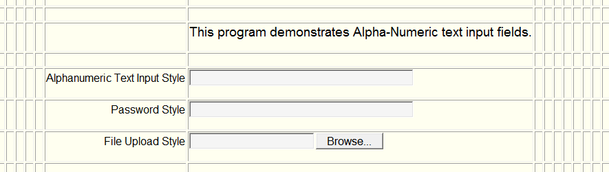
| Alphanumeric Text Input | These are input fields the user can change. For example, an address line or name field. |
| Internal (Program) Data Name | This is the name which your DLL will identify this control. This name will be used in the copybook generated by this editor. |
| Tab Index | The number input here defines where the cursor goes after pressing the tab key. Lower numbers come first. If all numbers have the same value a left to right then top to bottom tabbing sequence is used. -1 means no cursor/Tab stop. |
| Initial Value | This text will be displayed on the form but can be altered by the user. The size can be up to 160 characters. Certain special characters such as < or > are prohibited. |
| Horizontal Alignment | Defines how this control aligns horizontally within the cell. More than one control can occupy a cell. Some controls are taller or wider than others. This field helps define the visual presentation. |
| Vertical Alignment | Defines how this control aligns vertically within the cell. More than one control can occupy a cell. Some controls are taller or wider than others. This field helps define the visual presentation. |
| Text Alignment | Defines how the text aligns horizontally within this control. |
| Width of Text Control | This is the physical width of the control. Or how many characters can been seen. NOT how many characters can be keyed in. |
| Help Tip | If entered, a balloon help will appear over this control when the pointer cursor is hovered over it. It should be short, concise and to the point. ALL controls should make use of this field however it is not required. |
| Place Holder | A Place Holder is text that appears within the control. It disappears when a value is entered. It saves screen real estate by eliminating a static heading field. e.g. You have a 45 byte field for Name. If you put the word "Name" within the place holder description, then "Name" will appear within that field until an entry is made. |
| Alpha Text Attributes | |
| Maximum Allowable Characters | This is how many characters can be keyed in. |
| Text Style | |
| Normal | A typical text input control. Visible to the user. The user can input alphanumeric data. |
| Password | Used for password entry. It is NOT visible to the user. The user can input alphanumeric data. |
| Hidden | Used by programmers to store database keys and working storage items. It will not be seen by the user. It is never included in the HTML source code. It will appear to the programmer within the copybook. Values the programmer puts in will be saved and returned to the programmer. |
| Upload File | Used to upload a file from the user computer to the internet server where your DLL executes. The copybook will supply you the file name that was uploaded. The original file name will be proceeded by two $ characters. |
| GeoLocation | Used to retrieve the client's Latitude / Longitude co-ordinates.(These
co-ordinates can be mapped using GeoLocation mapping. See the Listbox options for mapping.) A special
200 byte structure is presented in the copybook: 05 your-data-name-here. 10 your-data-name-here-FREQ PIC 999. Is the geolocation sampling frequency in seconds. Setting to zero will retrieve one latitude/longitude set. Setting to 030 will retieve two geolocation sets 30 seconds apart and calculate the distance. 10 your-data-name-here-OLAT PIC X(15) Is the old latitude from the previous retrieval. 10 your-data-name-here-OLON PIC X(15) Is the old longitude from the previous retrieval. 10 your-data-name-here-NLAT PIC X(15) Is the NEW latitude from the previous retrieval. 10 your-data-name-here-NLON PIC X(15) Is the NEW longitude from the previous retrieval. 10 your-data-name-here-ACUR PIC 9(5) Is the accuracy of the new retrieval. In meters. 80 or less is very accurate. Cell phones or tablets with GPS are most accurate. 10 your-data-name-here-HDNG PIC 999 Is the heading of the new retrieval. In 0-359 degrees. Not all browsers support this attribute. 999 is undefined. 10 your-data-name-here-SPED PIC 999 Is the speed of the new retrieval. In meters per second. Not all browsers support this attribute. 999 is undefined. 10 your-data-name-here-DSTN PIC 9(5) Is the distance of the new retrieval. In meters. It requires 2 samples (an old and new latitude/longitued) in the structure. 99999 is uncalculated. |
| Immediate Return On Change | Indicates if your program gets control immediately after this field value is changed. Can also indicate to automatically TAB to the next field when full. |
| Font | The font to be used in this control. |
| Size | The font size to be used in this control. |
| Weight | The weight of the font to be used in this control. |
| Text Color | The font text color to be used in this control. |
| Location | |
| Row | The row this control is located in. Change this value to relocate the control to another spot on the form. |
| Column | The column this control is located in. Change this value to relocate the control to another spot on the form. |
| Menu Border Style | Indicates whether you would like a border, what shape, what color, and what size/thickness around this control. A border size of zero indicates you wish no border. |
| Special Cell Controls | The following fields alter the automatic sizing of cells. As previously mentioned cells and rows are automatically sized as controls are added. Sometimes it is nice to start with a new unsized grid. You can visually see the results of this by turning on the Show Row and Column Borders on the Default Properties form. |
| Column Span | This attribute defines the number of columns a cell should span. It is used as a cell sizing option. A way of reducing the width of surrounding cells by spanning it over several columns. |
| Row Span | This attribute defines the number of rows a cell should span. It is used as a cell sizing option. A way of reducing the height of surrounding cells by spanning it over several rows. |
| Start New Cell Sizing | If checked new cell sizing will begin with a new row. All rows and columns prior to this control will remain unchanged. It is best to check this box on the last control of the last column of a row. |
| MultiLine Text Input | This control allows a user to input one or more paragraphs of information. For example, comments, notes, or remarks. |
| Internal (Program) Data Name | This is the name which your DLL will identify this control. This name will be used in the copybook generated by this editor. |
| Tab Index | The number input here defines where the cursor goes after pressing the tab key. Lower numbers come first. If all numbers have the same value a left to right then top to bottom tabbing sequence is used. -1 means no cursor/Tab stop. |
| Initial Value | This text will be displayed on the form but can be altered by the user. The size can be up to 160 characters. Certain special characters such as < or > are prohibited. |
| Horizontal Alignment | Defines how this control aligns horizontally within the cell. More than one control can occupy a cell. Some controls are taller or wider than others. This field helps define the visual presentation. |
| Vertical Alignment | Defines how this control aligns vertically within the cell. More than one control can occupy a cell. Some controls are taller or wider than others. This field helps define the visual presentation. |
| Text Alignment | Defines how the text aligns horizontally within this control. |
| Height of Text Control | The number of lines that can be seen. NOT how many characters can be keyed in. |
| Help Tip | If entered, a balloon help will appear over this control when the pointer cursor is hovered over it. It should be short, concise and to the point. ALL controls should make use of this field however it is not required. |
| Place Holder | A Place Holder is text that appears within the control. It disappears when a value is entered. It saves screen real estate by eliminating a static heading field. e.g. You have a 45 byte field for Name. If you put the word "Name" within the place holder description, then "Name" will appear within that field until an entry is made. |
| MultiLine Text Attributes | |
| Maximum Allowable Characters Per Line | This maximum number of characters that can be keyed in per line. It will wrap to the next line when exceeded. |
| Maximum Allowable Number of Lines | This maximum number of lines that can be keyed. |
| Content Is Read Only ? | |
| Yes | Then the user will only be able to read the content. |
| No | Then the user can read and alter the content. |
| Font | The font to be used in this control. |
| Size | The font size to be used in this control. |
| Weight | The weight of the font to be used in this control. |
| Text Color | The font text color to be used in this control. |
| Location | |
| Row | The row this control is located in. Change this value to relocate the control to another spot on the form. |
| Column | The column this control is located in. Change this value to relocate the control to another spot on the form. |
| Menu Border Style | Indicates whether you would like a border, what shape, what color, and what size/thickness around this control. A border size of zero indicates you wish no border. |
| Special Cell Controls | The following fields alter the automatic sizing of cells. As previously mentioned cells and rows are automatically sized as controls are added. Sometimes it is nice to start with a new unsized grid. You can visually see the results of this by turning on the Show Row and Column Borders on the Default Properties form. |
| Column Span | This attribute defines the number of columns a cell should span. It is used as a cell sizing option. A way of reducing the width of surrounding cells by spanning it over several columns. |
| Row Span | This attribute defines the number of rows a cell should span. It is used as a cell sizing option. A way of reducing the height of surrounding cells by spanning it over several rows. |
| Start New Cell Sizing | If checked new cell sizing will begin with a new row. All rows and columns prior to this control will remain unchanged. It is best to check this box on the last control of the last column of a row. |
| Button | This is a control the user clicks to create an event. Examples would be "Finished", "Ok", "Update", "Continue". Standard and Custom buttons are supported. |
| Internal (Program) Data Name | This is the name which your DLL will identify this control. This name will be used in the copybook generated by this editor. |
| Tab Index | The number input here defines where the cursor goes after pressing the tab key. Lower numbers come first. If all numbers have the same value a left to right then top to bottom tabbing sequence is used. -1 means no cursor/Tab stop. |
| Horizontal Alignment | Defines how this control aligns horizontally within the cell. More than one control can occupy a cell. Some controls are taller or wider than others. This field helps define the visual presentation. |
| Vertical Alignment | Defines how this control aligns vertically within the cell. More than one control can occupy a cell. Some controls are taller or wider than others. This field helps define the visual presentation. |
| Label | The text for the button. Such as "Finished" or "Update". Often used to create a standard button. It can be combined with a graphical button but often not needed for graphic buttons. |
| Label Alignment | Defines how the label aligns horizontally within this control. |
| Folder | The folder in which a desired button image resides. The default is the current folder from which you are executing the editor. You can put your images in a different folder on the same level as the WebBOL editor. |
| Image | The file name of the button image. This is the image that will be displayed as a button on this form. NONE indicates you do not want to use a graphical image on this form. This field is optional. You can create a standard text based button by just using the label mentioned above. |
| URL | This is the web address to execute should this control be clicked upon. URL is an optional field. It can be as simple as a http:// web address or is can be a WebBOL-Execute.cgi?@form=???? to execute a different WebBOL form. Review the WebBOL Sample Menus 1, 2, or 3 for complete examples. Please note: To access an external website, you must use the prefix of "http(s)://" else the system will look into your system/folders for the file. However, many servers have security that disallows the use of external websites (http://). A 403 document forbidden, or a 404 or 405 error may occur. Your choices are to 1. deactivate that security or 2. write your own menus and put in the http(s):// links during the "init" program phase or 3. link to an internal htm file that has the full links. |
| URL Target | Indicates if you want a whole new browser page opened or to use the existing browser page should this control be clicked upon. Or NONE indicating this control is not associated with a URL. |
| New Window Width | If a URL is present and the target is a new window the you can control the width of the new window. |
| New Window Height | If a URL is present and the target is a new window the you can control the height of the new window. |
| Help Tip | If entered, a balloon help will appear over this control when the pointer cursor is hovered over it. It should be short, concise and to the point. ALL controls should make use of this field however it is not required. |
| Button Attributes | |
| Font | The font to be used in this control. |
| Size | The font size to be used in this control. |
| Weight | The weight of the font to be used in this control. |
| Text Color | The font text color to be used in this control. |
| Background Color | The background color to be used in this control. "BrowserDefault" will determine color and size for standard and graphical web buttons. |
| Hover Color | The hover color to be used in this control. "BrowserDefault" will determine color and size for standard and graphical web buttons. |
| Location | |
| Row | The row this control is located in. Change this value to relocate the control to another spot on the form. |
| Column | The column this control is located in. Change this value to relocate the control to another spot on the form. |
| Dimension | |
| Height | Determines the height of a standard or graphical based button. If background color and hover color were defined as "BrowserDefault" then leaving this value 0 will tell the system to calculate the dimension. Otherwise the units of measure is characters for text base button or pixels for a graphic based button. |
| Width | Determines the width of a standard or graphical based button. If background color and hover color were defined as "BrowserDefault" then leaving this value 0 will tell the system to calculate the dimension. Otherwise the units of measure is characters for text base button or pixels for a graphic based button. |
| Menu Border Style | Indicates whether you would like a border, what shape, what color, and what size/thickness around this control. A border size of zero indicates you wish no border. |
| Special Cell Controls | The following fields alter the automatic sizing of cells. As previously mentioned cells and rows are automatically sized as controls are added. Sometimes it is nice to start with a new unsized grid. You can visually see the results of this by turning on the Show Row and Column Borders on the Default Properties form. |
| Column Span | This attribute defines the number of columns a cell should span. It is used as a cell sizing option. A way of reducing the width of surrounding cells by spanning it over several columns. |
| Row Span | This attribute defines the number of rows a cell should span. It is used as a cell sizing option. A way of reducing the height of surrounding cells by spanning it over several rows. |
| Start New Cell Sizing | If checked new cell sizing will begin with a new row, with or without a border. The border will be placed around all future controls until turned off. The border is for accent only and not drawn to the border specifications selected above. All rows and columns prior to this control will remain unchanged. It is best to use this feature on the last control of the last column of a row. |
| Listbox | This control is used to display a list of choices to the user. Such as a list of employees or states. Standard, dropdown, and listview styles are supported. The listview style provides for multiple columns and headers. NOTE: Ipad, Iphone and Droids do not support dropdown list boxes. Standard and Listview styles work fine. |
| Internal (Program) Data Name | This is the name which your DLL will identify this control. This name will be used in the copybook generated by this editor. |
| Tab Index | The number input here defines where the cursor goes after pressing the tab key. Lower numbers come first. If all numbers have the same value a left to right then top to bottom tabbing sequence is used. -1 means no cursor/Tab stop. |
| Horizontal Alignment | Defines how this control aligns horizontally within the cell. More than one control can occupy a cell. Some controls are taller or wider than others. This field helps define the visual presentation. |
| Vertical Alignment | Defines how this control aligns vertically within the cell. More than one control can occupy a cell. Some controls are taller or wider than others. This field helps define the visual presentation. |
| Selection Alignment | Defines how the entries/selections align horizontally within this control. |
| Help Tip | If entered, a balloon help will appear over this control when the pointer cursor is hovered over it. It should be short, concise and to the point. ALL controls should make use of this field however it is not required. |
| Listbox Attributes | |
| Maximum Number of Entries | This maximum number of items or selections that will be contained within the listbox. The maximum number of rows for a listview style. |
| Maximum Width of Entry | This maximum width, in characters, of any listbox entry. |
| Immediate Return On Change/Click | |
| Yes, on change | Indicates your DLL should be called if the selection in this listbox has changed. |
| Yes, on click | Indicates your DLL should be called anytime a selection in this listbox is clicked. |
| Neither (No Return) | Indicates your DLL should not be called whether this listbox selection is clicked or changed. You desire to wait for a different event, like a button click. |
| Allow Multiple Selections | |
| Yes | Indicates the user can select multiple items or entries in this listbox. This is accomplished by holding the CTRL key down and clicking on the desired entry. |
| No | Indicates the user can select only one item or entry in the listbox. When an item is selected any previous selections are deselected. |
| Type of Listbox | |
| Standard Listbox | Indicates standard open listbox or dropdown listbox should be drawn by the system. NOTE: dropdown listboxes are NOT currently supported by the Motorola Droid, Apple Iphone or Apple Ipad browsers. Apple Safari does support dropdown listboxes. If you need to support these platforms consider using an open listbox or the listview style mentioned below. See WebBOL Sample programs for examples of all types of listboxes. |
| ComboBox Style | Indicates the custom control ComboBox should be drawn by the system. A ComboBox is just what the name implies. A combination of two different controls. A alphanumeric input control with a dropdown listbox control. This allows your user to select from a list or key in their own value. If keyed in, this new value will be placed in the listbox and returned to your program. See WebBOL Sample programs for examples of all types of listboxes. |
| Listview Style | Indicates a listview style listbox should be drawn by the system. A listview style listbox has more than one column with internal column headers. NOTE: dropdown listboxes ARE currently supported by the Motorola Droid, Apple Iphone or Apple Ipad browsers. See WebBOL Sample programs for examples of all types of listboxes. |
| Date Picker Style | Indicates you want the user to select a date. When clicked a popup window with a month and day selection will be presented. The selected date will be returned in yyyy/mm/dd format. To start the display at a certain date, it should be initialized with a date in yyyy/mm/dd format. |
| Color Picker Style | Indicates you want the user to select a color. When clicked a popup window of 140 web/internet safe colors will be presented. The selected color will be returned to your program for processing. |
| Map Coordinantes | Allows you to draw a map for the client. You can
mark a particular spot on the map. You can specify several digital waypoints or addresses to map a route. It will calculate distances between
the different points on the route. It can optimize the route. It can show traffic. You specify parameters (map size and options) in the first
3 occurrences of the listbox. The remaining occurrences are for points on a route. The structure follows: * OCCURRENCE 1 is for your Google Mapping API Key, the system uses google api's to draw the map. Search "Google Maps API Key" to get a key or try https://developers.google.com/maps/documentation/javascript/get-api-key * OCCURRENCE 2 is a digital latitude/longitude map marker. Do Not Use an address or degrees/minutes/seconds format. It has 5 parameters. Each parameter is separated by a comma. Use 0,0 when no marker is desired. Latitude Longitude Sound play switch (Y/N) Color for Marker in Hex (#f00000 is red) Title/Balloon Info for Marker e.g. 35.8884,-82.878432,Y,#f00000,New Driver Location Found ! * OCCURRENCE 3 has 4 parameters to control the map. It controls map height, width, traffic and routing. Each parameter is separated by a comma. 3 digit height: px (pixels) or % (percent of screen) 3 digit width: px (pixels) or % (percent of screen) display traffic or not, values: traffic or none optimize route or not, values: true or false e.g. 450px,50%,traffic,true e.g. 60%,50%,none,false * OCCURRENCE 4 - 28 are addresses or digital waypoints. Do Not Use degrees/minutes/seconds format. The more complete the address, the more accurate mapping. If digital, separate lat/long with a comma. e.g. 35.8884,-82.878432 Partial address is ok. e.g. Atlanta, GA |
| Font | The font to be used in this control. |
| Size | The font size to be used in this control. We allow whole sizes e.g. 10, 12 as well as the selection of 10ths e.g. .50, .65 To allow maximum screen real estate usage. |
| Weight | The weight of the font to be used in this control. |
| Text Color | The font text color to be used in this control. |
| Background Color | The background color to be used in this control. |
| Accent Color | The accent color is used to highlight selections. Mostly used in the listview style listbox. However, it is under programmer control as to when to accent an entry or not. |
| Location | |
| Row | The row this control is located in. Change this value to relocate the control to another spot on the form. |
| Column | The column this control is located in. Change this value to relocate the control to another spot on the form. |
| Menu Border Style | Indicates whether you would like a border, what shape, what color, and what size/thickness around this control. A border size of zero indicates you wish no border. |
| Special Cell Controls | The following fields alter the automatic sizing of cells. As previously mentioned cells and rows are automatically sized as controls are added. Sometimes it is nice to start with a new unsized grid. You can visually see the results of this by turning on the Show Row and Column Borders on the Default Properties form. |
| Column Span | This attribute defines the number of columns a cell should span. It is used as a cell sizing option. A way of reducing the width of surrounding cells by spanning it over several columns. |
| Row Span | This attribute defines the number of rows a cell should span. It is used as a cell sizing option. A way of reducing the height of surrounding cells by spanning it over several rows. |
| Start New Cell Sizing | If checked new cell sizing will begin with a new row, with or without a border. The border will be placed around all future controls until turned off. The border is for accent only and not drawn to the border specifications selected above. All rows and columns prior to this control will remain unchanged. It is best to use this feature on the last control of the last column of a row. |
| Standard Listbox/ComboBox Properties | |
| Height | Number Of Entries Tall, Height Of One (1) Will Create A DropDown ListBox. Use a value larger than 1 for ComboBoxes |
| Width | Width Of ListBox In Characters, If Left Zero (0) The System Will Figure It Out. This value is ignored for ComboBoxes. |
| Listview Style Properties | |
| Columns | The number of columns this control will need. |
| WebBOL Sorted Columns | Check to let WebBOL, rather than your program, control the column sorting. |
| Rows | The number of rows visible to the user. NOT the maximum number of rows that can be loaded with data. |
| Hover Color | The hover color will be used in this control when the pointer cursor pauses on a row,cell location within this listview control. |
| 1st Alternating Color | This color will be used as a background color on all odd numbered rows or columns. This helps the user discern data across multiple columns of data. |
| 2nd Alternating Color | This color will be used as a background color on all even numbered rows or columns. This helps the user discern data across multiple columns of data. |
| Display Alternating Colors | This defines how the alternating colors will be displayed. Horizontally (rows) or Vertically (columns). |
| Restrict Column Width (In Pixels) | Can help the programmer control the size of each column of a listbox. Data in restricted column sizes will wrap to the next line. |
| Radio Buttons | Are used to display choices in which only one can be selected. For example, if you wanted the user to select a color choice but only one. You could show 4 radio buttons with the labels of red, green, blue, black. Each time a radio button is clicked the other radio buttons turn off. |
| Internal (Program) Data Name | This is the name which your DLL will identify this control. This name will be used in the copybook generated by this editor. |
| Tab Index | The number input here defines where the cursor goes after pressing the tab key. Lower numbers come first. If all numbers have the same value a left to right then top to bottom tabbing sequence is used. -1 means no cursor/Tab stop. |
| Horizontal Alignment | Defines how this control aligns horizontally within the cell. More than one control can occupy a cell. Some controls are taller or wider than others. This field helps define the visual presentation. |
| Vertical Alignment | Defines how this control aligns vertically within the cell. More than one control can occupy a cell. Some controls are taller or wider than others. This field helps define the visual presentation. |
| Width | This is the width of the radion button control in characters. If left zero the system will figure it out. |
| Help Tip | If entered, a balloon help will appear over this control when the pointer cursor is hovered over it. It should be short, concise and to the point. ALL controls should make use of this field however it is not required. |
| Radio Button Attributes | |
| Immediate Return On Change | |
| Yes | Indicates your DLL should be called if the selection in this radio button control has changed. |
| No | Indicates your DLL should be NOT called anytime a selection in this radio button control is clicked. |
| Left or Right Label | |
| Left | Indicates radio button labels should be drawn on the left side of the button. |
| Right | Indicates radio button labels should be drawn on the right side of the button. This is the typical selection. |
| Orientation | |
| Vertical | Indicates your radio buttons should be drawn vertically. This is the typical selection. |
| Horizontal | Indicates your radio buttons should be drawn horizontally. |
| Font | The font to be used in this control. |
| Size | The font size to be used in this control. |
| Weight | The weight of the font to be used in this control. |
| Text Color | The font text color to be used in this control. |
| Background Color | The background color to be used in this control. |
| Location | |
| Row | The row this control is located in. Change this value to relocate the control to another spot on the form. |
| Column | The column this control is located in. Change this value to relocate the control to another spot on the form. |
| Menu Border Style | Indicates whether you would like a border, what shape, what color, and what size/thickness around this control. A border size of zero indicates you wish no border. You should consider a small black border around your radio buttons. It helps visually separate different groups of radio buttons. |
| Special Cell Controls | The following fields alter the automatic sizing of cells. As previously mentioned cells and rows are automatically sized as controls are added. Sometimes it is nice to start with a new unsized grid. You can visually see the results of this by turning on the Show Row and Column Borders on the Default Properties form. |
| Column Span | This attribute defines the number of columns a cell should span. It is used as a cell sizing option. A way of reducing the width of surrounding cells by spanning it over several columns. |
| Row Span | This attribute defines the number of rows a cell should span. It is used as a cell sizing option. A way of reducing the height of surrounding cells by spanning it over several rows. |
| Start New Cell Sizing | If checked new cell sizing will begin with a new row. All rows and columns prior to this control will remain unchanged. It is best to check this box on the last control of the last column of a row. |
| Radio Button Items | The following fields define the labels and on/off state of your radio buttons. See WebBOL Sample programs for examples. |
| Radio Button Label | This text associated with a radio button. e.g. "Green", "Red", "Blue" |
| Checked | This indicates this radio button will be initially shown with the button checked or on. |
| UnChecked | This indicates this radio button will be initially shown with the button unchecked or off. |
| CheckBoxes | Are used to display one option to a user. For example, a check box with a label "Do you want to be notified ?" would indicate yes if checked, no if not checked. Much more efficient than a having 2 radio buttons of yes and no. |
| Internal (Program) Data Name | This is the name which your DLL will identify this control. This name will be used in the copybook generated by this editor. |
| Tab Index | The number input here defines where the cursor goes after pressing the tab key. Lower numbers come first. If all numbers have the same value a left to right then top to bottom tabbing sequence is used. -1 means no cursor/Tab stop. |
| Horizontal Alignment | Defines how this control aligns horizontally within the cell. More than one control can occupy a cell. Some controls are taller or wider than others. This field helps define the visual presentation. |
| Vertical Alignment | Defines how this control aligns vertically within the cell. More than one control can occupy a cell. Some controls are taller or wider than others. This field helps define the visual presentation. |
| Width | This is the width of the checkbox control in characters. If left zero the system will figure it out. |
| Help Tip | If entered, a balloon help will appear over this control when the pointer cursor is hovered over it. It should be short, concise and to the point. ALL controls should make use of this field however it is not required. |
| Checkbox Attributes | |
| Immediate Return On Change | |
| Yes | Indicates your DLL should be called if the selection in this checkbox control has changed. |
| No | Indicates your DLL should be NOT called anytime a selection in this checkbox control is clicked. |
| Left or Right Label | |
| Left | Indicates the checkbox label should be drawn on the left side of the button. |
| Right | Indicates the checkbox label should be drawn on the right side of the button. This is the typical selection. |
| Initial State | |
| Checked | This indicates this checkbox will be initially shown with the box checked or on. |
| UnChecked | This indicates this checkbox will be initially shown with the box unchecked or off. |
| Font | The font to be used in this control. |
| Size | The font size to be used in this control. |
| Weight | The weight of the font to be used in this control. |
| Text Color | The font text color to be used in this control. |
| Background Color | The background color to be used in this control. |
| Location | |
| Row | The row this control is located in. Change this value to relocate the control to another spot on the form. |
| Column | The column this control is located in. Change this value to relocate the control to another spot on the form. |
| Menu Border Style | Indicates whether you would like a border, what shape, what color, and what size/thickness around this control. A border size of zero indicates you wish no border. You should consider a small black border around your radio buttons. It helps visually separate different groups of radio buttons. |
| Special Cell Controls | The following fields alter the automatic sizing of cells. As previously mentioned cells and rows are automatically sized as controls are added. Sometimes it is nice to start with a new unsized grid. You can visually see the results of this by turning on the Show Row and Column Borders on the Default Properties form. |
| Column Span | This attribute defines the number of columns a cell should span. It is used as a cell sizing option. A way of reducing the width of surrounding cells by spanning it over several columns. |
| Row Span | This attribute defines the number of rows a cell should span. It is used as a cell sizing option. A way of reducing the height of surrounding cells by spanning it over several rows. |
| Start New Cell Sizing | If checked new cell sizing will begin with a new row. All rows and columns prior to this control will remain unchanged. It is best to check this box on the last control of the last column of a row. |
| InLine Link | Are a very unique control. It allows you to display a web page within a webpage. Complete with its own scrollbars, clicking, refreshing, responses. Everything. This feature seems to be very useful in dashboard displays where information is being collected and displayed from several different websites. |
| URL | This is the web address will be displayed in the area defined below. URL is an required field. It is as simple as a http:// web address. Review the WebBOL Sample Programs for a example. Please note: To access an external website, you must use the prefix of "http(s)://" else the system will look into your system/folders for the file. However, many servers have security that disallows the use of external websites (http://). A 403 document forbidden, or a 404 or 405 error may occur. Your choices are to 1. deactivate that security or 2. write your own menus and put in the http(s):// links during the "init" program phase or 3. link to an internal htm file that has the full links. |
| Height | The visual height of the control, in characters. |
| Width | The Visual Width As A Percentage Of Screen Real Estate (Control Width Moves With Screen Sizing) |
| InLine LinkAttributes | |
| Location | |
| Row | The row this control is located in. Change this value to relocate the control to another spot on the form. |
| Column | The column this control is located in. Change this value to relocate the control to another spot on the form. |
| Menu Border Style | Indicates whether you would like a border, what shape, what color, and what size/thickness around this control. A border size of zero indicates you wish no border. You should consider a small black border around your radio buttons. It helps visually separate different groups of radio buttons. |
| Special Cell Controls | The following fields alter the automatic sizing of cells. As previously mentioned cells and rows are automatically sized as controls are added. Sometimes it is nice to start with a new unsized grid. You can visually see the results of this by turning on the Show Row and Column Borders on the Default Properties form. |
| Column Span | This attribute defines the number of columns a cell should span. It is used as a cell sizing option. A way of reducing the width of surrounding cells by spanning it over several columns. |
| Row Span | This attribute defines the number of rows a cell should span. It is used as a cell sizing option. A way of reducing the height of surrounding cells by spanning it over several rows. |
| Start New Cell Sizing | If checked new cell sizing will begin with a new row. All rows and columns prior to this control will remain unchanged. It is best to check this box on the last control of the last column of a row. |